Microsoft Power BI Usage Metrics give you insights into how your reports and dashboards are being used. In simple terms, it’s the analytics of your analytics. With usage metrics, you can:

In the world of business intelligence, creating a report or dashboard often feels like reaching the finish line. You’ve connected your data sources, built the visuals, applied the Data Analysis Expressions (DAX) measures, and made sure everything looks polished. Then you publish it to Microsoft Power BI Service, share the link with your team or leadership, and move on to the next report.
But here’s the thing: Have you ever wondered what happens after you hit ‘Publish’? Does anyone use the report? Are they looking at the pages you designed so carefully? Are they finding it helpful or are they confused and abandoning it?
As Microsoft Power BI users, developers, and analysts, we often focus so much on building reports that we forget to track their impact. This is where Microsoft Power BI Usage Metrics become a game changer.
Microsoft Power BI Usage Metrics give you insights into how your reports and dashboards are being used. In simple terms, it’s the analytics of your analytics. With usage metrics, you can:
It’s like having a behind-the-scenes dashboard that shows how your reports are performing in the real world.
Here’s why usage metrics are important for every Microsoft Power BI professional:
1. Measure Adoption: Get clarity on which reports are valuable to users and which aren’t.
2. Iterate & Improve: If a report page has low engagement, maybe it needs a layout change, or maybe users aren’t finding it helpful.
3. Declutter Workspace: Don’t waste time maintaining reports that no one is using. Use data to decide what stays and what goes.
4. Prove Value to Stakeholders: Show managers or leadership how widely reports are being used to drive informed decisions.
5. Ensure Proper Access: Confirm the right people are accessing the right data, and flag unexpected usage.
Usage metrics in analytics tools give organizations a powerful lens into how their BI solutions are actually being used, enabling them to measure impact by tracking how frequently reports and dashboards are accessed and ensuring that analytics investments deliver real business value. By highlighting the most popular visualizations, KPIs, and datasets, usage metrics reveal which insights drive decision making and where user attention is focused. This clarity allows teams to optimize resources retiring or consolidating underused content to reduce maintenance overhead while targeted training and communications can be directed toward areas of low adoption to boost overall engagement. Ultimately, basing your roadmap on real usage data rather than assumptions ensures that future enhancements align with user needs, transforming passive activity logs into actionable intelligence and maximizing the return on your analytics investment.
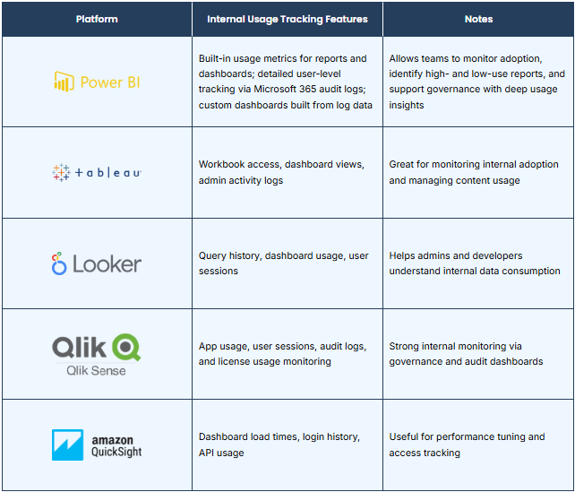
Before exploring usage metrics, keep these important prerequisites and limitations in mind to ensure you get accurate insights:
Once you’ve published a report in the Microsoft Power BI Service, you can easily view its usage statistics if you have the right permissions. These built-in metrics help you track user behavior and report adoption.
Let’s walk through the steps to access usage metrics for a report.
Log in to the Microsoft Power BI Service with your work credentials. Navigate to the workspace where your report is published. Note: Usage metrics are only available for reports published in a workspace backed by a Microsoft Power BI Premium or Pro license.
Once inside the workspace, locate the report for which you want to view the usage data.
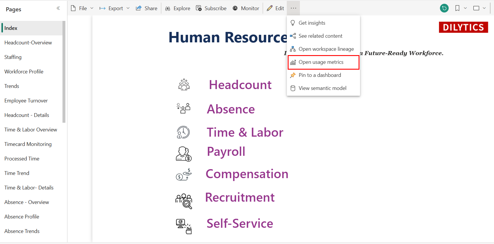
Hover over the report, click the ellipsis (…), and select Usage Metrics from the dropdown menu.
Microsoft Power BI generates a default usage report, showing:
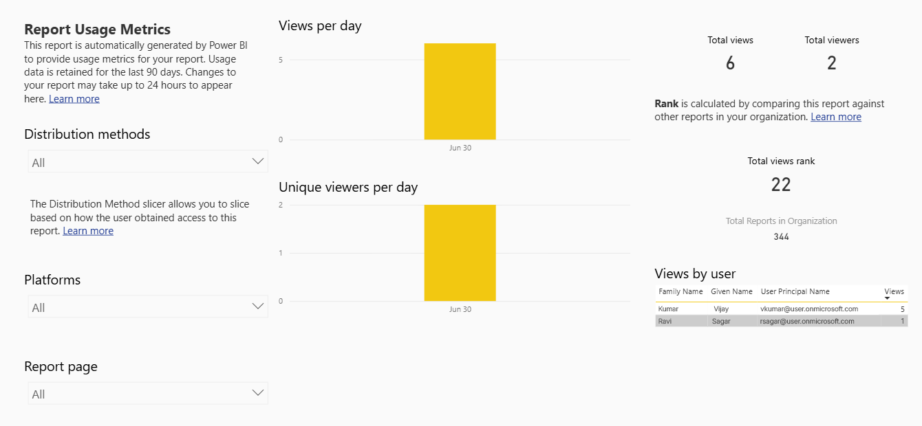
Consumption by Platform (web/mobile, etc.)
This is a prebuilt report that can help you quickly assess how your report is performing over time.
Did you know you can build a fully customized usage metrics report in Microsoft Power BI using audit log data?
While the default usage report in Microsoft Power BI Service offers basic insights, it isn’t directly customizable. Instead, we accessed Microsoft Power BI activity data from audit logs and used it to create a custom report tailored to our needs.
Once the audit log data is extracted (via Microsoft 365 Compliance Center or PowerShell), you’re free to:
This approach goes beyond the limitations of the built-in report, letting you craft a usage dashboard that truly reflects how your reports are being used-all while maintaining full control over data structure, filters, and presentation.
In one of our recent Microsoft Power BI projects for LACSD (Los Angeles County Sanitation Districts), we implemented a dedicated Usage Metrics Report as part of our delivery. The goal was simple: track how their internal reports were being consumed by users and use that insight to make smarter data decisions.
LACSD had several reports published in the Microsoft Power BI service across multiple departments. While some were built for leadership-level insights and others for operational monitoring, there was no clear way to know which reports were being used regularly, and which ones were gathering dust.
They asked us:
“Can we track which reports people are using? We want to optimize our Microsoft Power BI environment and stop maintaining reports that aren’t helpful.”
We delivered a single, interactive Usage Metrics Dashboard that combined:
Here are some of the key benefits organizations can achieve by leveraging Microsoft Power BI usage metrics:
Seeing real usage data completely shifted our approach. We went from reacting to requests, to proactively optimizing our entire Microsoft Power BI ecosystem. By turning passive usage logs into actionable insights, our custom Usage Metrics Report not only improved operational efficiency but also fostered a more data-driven culture at LACSD.
DiLytics helps organizations modernize analytics, improve decision-making, and turn complex data into a competitive advantage.